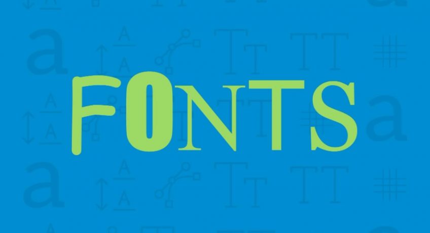
How To Know font choice If A Font Is Good To Choose. Font does matter to design choices especially if you want highlight the your own brand identity through your project. Font can tell something significant which affect how the image of the brand is perceived by audience. For those who are not familiar with graphic design, the font choice is limited to what Microsoft Office has. Those are pre-load as default choices so you can just use them for various purpose such as writing paper, making slides for presentation, etc.

However, there are many other types of font family you can also download online. You can buy them or download the free version if available. They are made by skilled designers to help you create unique style for your project through custom fonts and typefaces. Since there are so many of them, you need to choose the one that really fits your needs. For that, you have to know what makes a font good. Here are some points to consider:
Kerning or The Space
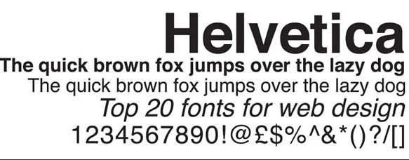
The first thing to consider a font good is through its kerning or the space between two characters. If the space is too close, the characters will be unreadable. However, it is hard to tell if the two characters are supposed to be in one unit or not if the space is too large either. Not to mention that there are also fonts with uneven kerning, making them look confusing. A good font is when the kerning is even between each character. Helvetica is often chosen because of its readability and one of the reasons of it is its even kerning.
Every font may feature particular qualities from style or design. However, a font good has consistency to those qualities. A good font has consistency to its style. For example, a font has thin letters with round corner and soft edges. However, the style doesn’t extend to its punctuation and number. It will only make that font look inconsistent and not in harmony. They look different even when they are applied the same font. Thus, choose font with a great consistency to its qualities.
Garamond
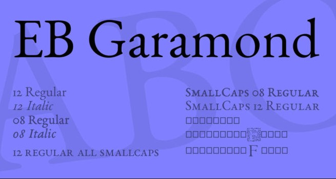
The legibility of font should considered to determine a good font. You can try writing variety of word using a particular font to see its eligibility. Combine with every type of letters, numbers, etc. You can also try scaling up and down to see if they are still eligible. Font with great eligibility is Garamond. They are still eligible even if you use them in different context from different colors, sizes, to compositions. A good font also has good balance to its thickness and weight, and width. Thus, it makes the font look more interesting and beautiful.
Several best fonts that have been popular for their best characteristics and features are Bodoni, Didot, Futura, Garamond, Helvetica, Gill Sans, Baskerville, Proxima Nova, Verdana, and Clarendon. They fulfill the criteria of what makes a font good. They have also great readability as well as srtictic features to complement their look. Thus, they look beautiful, attractive, while easy to read.