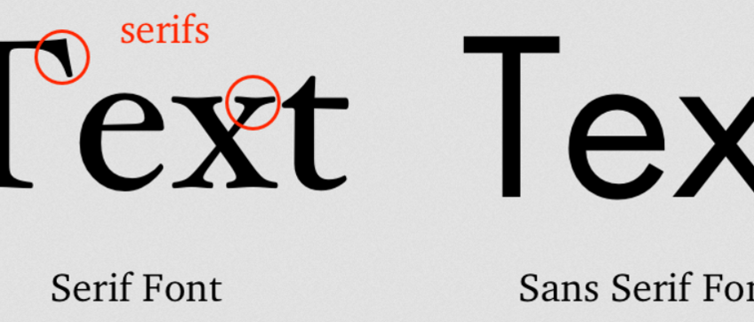
How To Choose The Best Between Serifs Fonts And Non-Serifs Fonts. Basically, there are serifs and non-serifs you can choose for printing materials or publishing. Serif fonts are also known as little feet. You can see that ‘little feet’ appear at the ends of every letter. There are wide variety of serif fonts you can choose for various purpose. If you are into designing, there are wide selections of them. For designing or branding, serifs fonts are often used because they look more interesting and attractive with all additional details. However, serif fonts still look clean and elegant even with all those details.
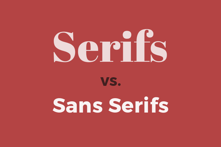
Font Serifs And Font Sans Serifs(non-serisfs).
Fonts are significant both for academic and commercial purpose. The choice of fonts can create certain moods and feels. That’s why fonts do matter for designers. For example, a logo is important for a brand to represent its image. The choice of fonts in the logo also matter to create an image that the brand want to to present to the audience. If the fonts resonate the image that the brand wants to show, the impact will be great to the brand. Unique logo with the help of interesting fonts will be reminded for a long time.
There are many serifs fonts you can choose from. Here are several of my favorites you may consider especially if you are into design:
Hermann font family provide great readability and one of the most favorites for design teams. It was inspired by the novel of Hermann Hesse in the 20th century. He was one of the most profilic authors at that time. The font itself delivers wildness as well as surrealism and duality. If you want to create a mood of wild and bold, the choice of Hermann font can be great. It is available as well in various options including old and italic.
Blacker is another great choice of serif font you can choose. This is a wedge type of serif font with high contrast. It was created in 1970 by Cosimo Lorenzo Pancini and Andrea Tartarelli. In Blacker, you can see that the font look superior with all the features highlighting the letters. There are varieties of Blacker you can choose with two optical sizes as well as six weights.
Linotype Didot is such a classic, elegant font that was created a s tribute to the Didot family. They are one of the most respectable print shop and font foundries in France. The intricate design and elegant style still featured authenticity of the original Didot family.
Recoleta is also an interesting font you can use for many purpose especially logo design. This font has more modern, fresh, new look to it. The shapes are characteristically gentle and soft. However, it also has fluid strokes angled in every character. Recoleta looks familiar but still has business-y vibe. That’s why this font is also often used in business logo or business card. The font looks professional but still in a non-intimidating way. There are also other font options of Recoleta based on its weight that are good for headings.