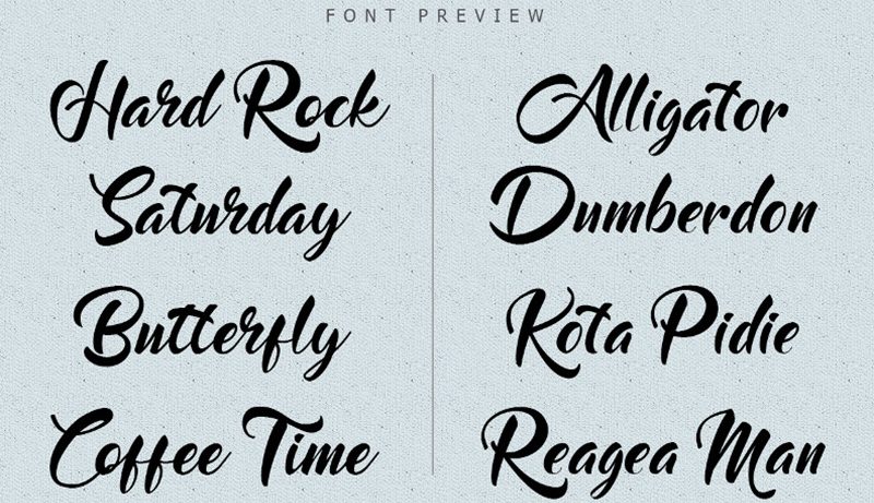
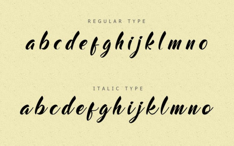
Choose The Right Fonts For Your Project is the good tips for you. There are several factors you can consider to see if a font is good or not. You can see from the space between two characters or kerning. You can also see from the font’s eligibility when it is applied in different contexts. Another way to see if a font is good is from its balance between thickness, weight, width, etc. A font will look good if it’s readable to the audience. There are bad and good fonts out there you can choose for your project. However, even not all good fonts are suitable for your project. Thus, you need to select based on what you want to showcase through the project.
Basically choose the font rare to use
For your project to have more personal brand or identity, it is highly recommended to not choose overused font because they look too generic. It will make your project look overused and stale. There is no fresh vibe to it if overused font is being used. Fonts that are not balance in term of weight, placement, thickness, height, etc are good to be ignored. You can choose another better option. Imbalanced fonts are not only illegible but also not looking good from artistic point of view.
Fonts too hard to read are not best options. They are the worst because how can you deliver authentic personal brand if people can read your message well. Some fonts have those unnecessary flairs that don’t make them good but worst instead. Unnecessary flairs often make audience difficult to read the text because they are too distracting.
Follow the concept of your lifestyle
It is also highly recommended to avoid boring or dull fonts that look too common. They are not bad font per se but they look too dull to bring out any character to live. If you want your project to be unique and authentic, choose outstanding fonts that can compliment your brand identity. Choose a font that can resonate your brand while communicate it in a more meaningful way. If you want your project to be more eye-catching and impactful, avoid font like Times New Roman because it looks dull and there is nothing special on it. This font is more suitable for academic writing or project.
You want to do your best for your design project. Choosing the right font is one of things you can do to make it. Avoid bad fonts that lack of qualities mentioned earlier. Also, choose a good font that is good for your project. Just because a font is readable or balance in various contexts doesn’t make it fit your project. Choosing the right font for your project means you need to consider how appropriate and how aesthetically pleasing the font is for your brand. Also, choose a well-crafted font.
If you are overwhelmed with so many choices, try to think back of what you want to convey through the project. What kind of persona you want to show to your audience. Every font has their own characteristics to show particular effects.