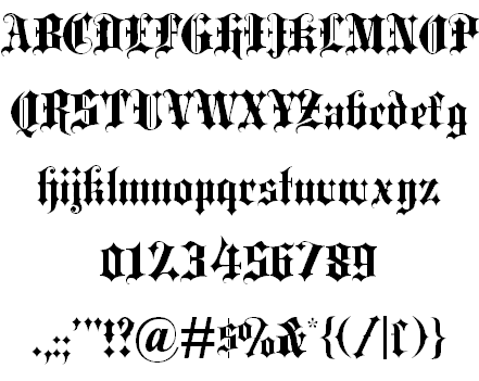
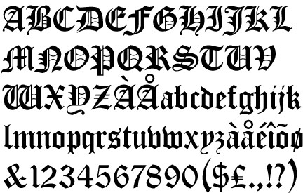
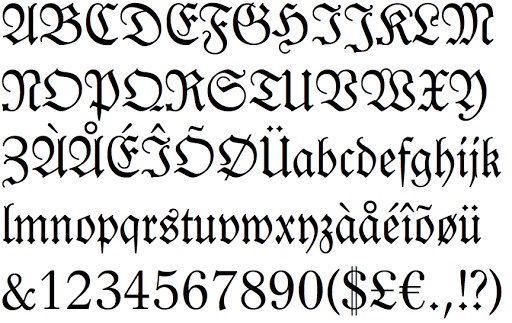
Very Interesting Facts About Ancient English Fonts. You may have heard about old English Fonts or some dadu online people refer it to the Blackletter typeface. This kind of types was once used in one of the oldest books to be printed in Europe called Guthenburg Bible. It was one of the very first books that was printed at that time. The Blackletter typeface was often used at that time due to its interesting features. It has unique strokes which features think and thick lines. You can also see that some of the Blackletter fonts has additional swirls especially on the serifs. The Blackletter typeface was said to be inspired from early manuscript lettering.
The Blackletter Typeface.
Very Interesting Facts About Ancient English Fonts. The Blackletter typeface has been evolved from the mid 12th century. It started in Western Europe. Then, wide variety of Blackletter has appeared over the time. However, there are are at least four family that can be considered most remarkable. They are Rotunda, Textura, Fraktur, and Schwabacher. You can find yourself the difference between the families. The differences of the serifs are really significant and visible that you can identify them in short glance.
It is true that one of the most interesting parts of the Blackletter fonts is the dramatic strokes between thin and thick lines. It makes the characters look more mysterious, classic, traditional, and artistically beautiful. There are also diagonal, thin serifs on lower case letters. The use of the Blackletter typeface was only for bible and books during Guthenburg era. However, it marked the the new era of the use of this font for printing as well. Blackletter fonts are beautiful to look at but still difficult to read as body text. If it is compared. Roman and Italic are much easier to print.
The reason of being less readable for printing was also the cause of why in 1500s, Blackletter typeface was less popular for printing. However, it was different in Germany. This country still continued to use the fonts back then until the early 20th century. Then, the use of this typeface was getting rare. It was even considered to be antiquated by German publishers and designers at that time. It was replaces by new typography of various sans serif typefaces.
Very Interesting Facts About Ancient English Fonts.
The new typography was declared to be un-German by Hitler. Then, Fraktur continued to be used as Volk, or the people’s fonts by Nazis. Only until 1941 it was replaced by more readable fonts. Lots of people associate Blackletter typeface as Nazi fonts. However, it is not true at all. There are real history behind Blackletter typeface. You can check it out on various sources if you want to learn more about it.
Blackletter fonts are best to used for heading instead of body text because as mentioned earlier that it provide less readability in body text. Blackletter is also great for making logos, signs, posters, and commercial advertisement. This typeface is also often used in certificate because of its classic and intricate design. There have been free Blackletter fonts you can download if you are interested in using them for any purpose.